
previous colors:
blue and yellow
mustard and deep carmine pink
autumn?
red, white, and blizzard blue
WHITE
wood you be mine?
black + green
brass + gold
yellow // grey
happy weekend, hooray!
j.


I ART U All rights reserved © Blog Milk Powered by Blogger
i love the details...
ReplyDeletethank you for the "Friday's colors" posts!
I'm so smitten with this!
ReplyDeletexx
gosh, i LOVE this. absolutely beautiful.
ReplyDeleteso glad to see friday's colors back!! i've missed it! fabulous, as always!!
ReplyDeletenew yawwwwk colors!!!
ReplyDeletejen, you've always been a freaking genius at color schemes. <3
ReplyDeleteLove this post! Really awesome how you took the photos!:)
ReplyDeleteyou have such a great blog by the way!i'm happy i ran into it:) I really like your style and reading your posts!
So i'm your newest follower:)
hope you visit me back and become my follower too!
Love,fashionfabrice!
Have a fabulous day!
Love the photos, but they brought this article to mind :)
ReplyDeletehttp://theabyssgazes.blogspot.com/2010/03/teal-and-orange-hollywood-please-stop.html
wow wow and wow. i'm a newby to your blog, but i'm so in love! you capture such a unique essence and vitality in life! lovely...simply lovely!
ReplyDeleteIt was quite a blue weekend here in Texas. We had gorgeous skies on Friday/Saturday and then stormy skies on Sunday. Quite the spectrum! Love these photos! Hope your weekend was great!
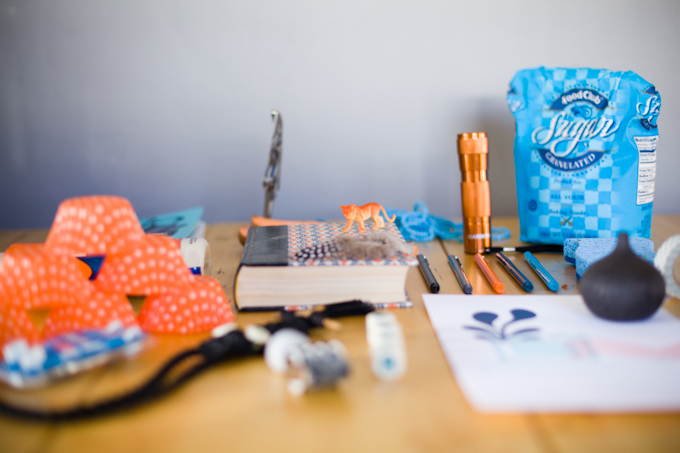
ReplyDeleteThis palette is lovely. I love how it pops and yet manages to sooth at the same time.
ReplyDeleteReally really love this combination!
ReplyDeleteI love this color scheme! Great blog, I'm glad I found it!
ReplyDeletehttp://akadamson.blogspot.com/
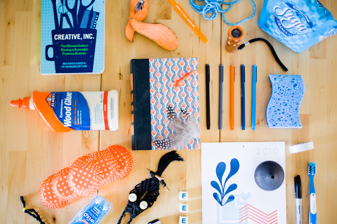
YAY Friday colors!!!! These are some of my favorite posts you do. Love this color scheme...looks a lot like what we were originally going for in our living room but we never really managed to get much of the orange in there. Still one of my all-time fave combos though!
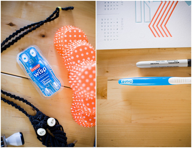
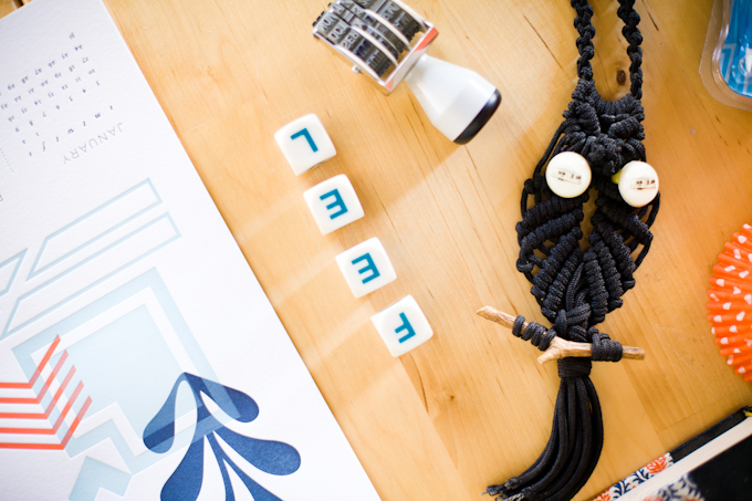
ReplyDeletealso: toothbrush. genius. my favorite part.
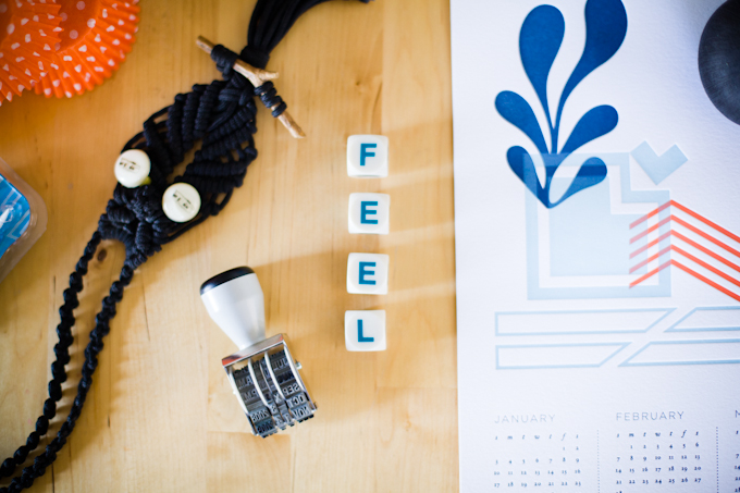
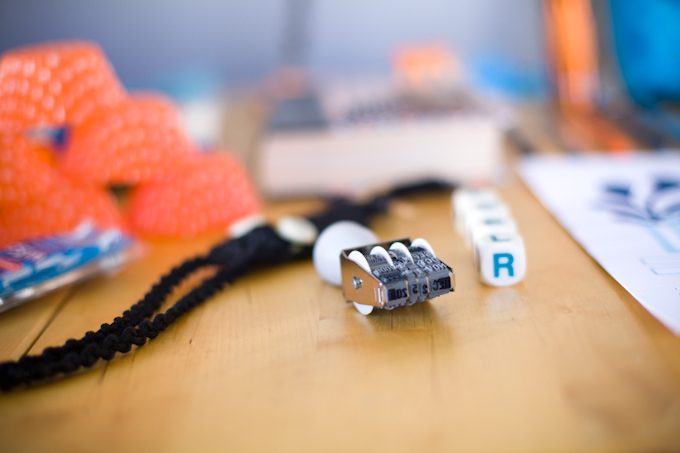
also also: where did you get your rubber date stamp? we're looking for one...
P.S. I just noticed you switched the header! i think that was the first version Curt made. looks fab :)
ReplyDeleteyou have such a good eye for styling and colors! love all the pops of bright blue and orange.
ReplyDeletehope you had a fabulous weekend.
love this color combination
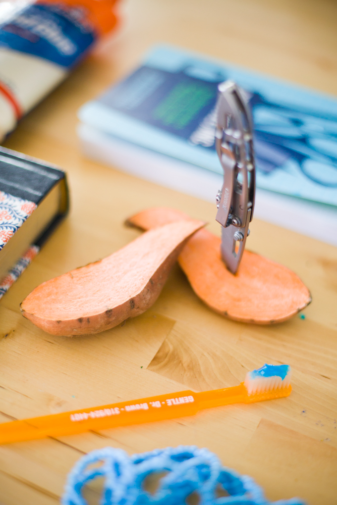
ReplyDeleteYes! Stab the sweet potato with the knife!
ReplyDeleteI dig it + I think you have a wonderful conceptual process here!
beautiful work. love the photos! :)
ReplyDeletei wander, i wonder
I was just doing some random clicking and fell upon your flickr so now here I am and might I add, totally in love. Your work is amazing
ReplyDeleteLovely.
ReplyDelete